Data Visualisation
The purpose of visualization is insight, not pictures. - Ben A. Shneiderman
Before starting visualisation, you should ask yourself for whom you’re visualising the data”?
- yourself to explore the data
- or declaring a point to someone else
Visualization gives you answers to questions you didn’t know you had. - Ben Schneiderman
Either way, it helps:
- Analysing the data in a better way
- Simplifying complicated data to make sense of them
- And eventually accelerating the process of decision making. (persuading someone else)
Data visualization is an aid from the beginning to the end of the typical data science pipeline. It improves the understanding and communication of the data for both data experts and end users. - Samara Vazquez Perez
But visualisation tools for exploration may vary from representation ones.
Some of useful tools are :
- Matplotlib
- Seaborn
- Geoplotlib
- GeoPandas
- Cartopy
- Bokeh
- Altair
- Plotnine
- Pygal
- Plotly
- Missingno
- Gleam
- Leather
- Folium
In this notebook we’ll use Matplotlib and Seaborn.
First Plot with Matplotlib
import numpy as np
import pandas as pd
pd.plotting.register_matplotlib_converters()
import matplotlib.pyplot as plt
%matplotlib inline
import seaborn as sns
sns.set_style("dark")
sns.set(rc={'figure.figsize':(12,8)})
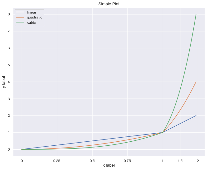
x = np.linspace(0, 2, 100)
plt.figure(figsize=(10, 8), dpi=80)
plt.plot(x, x, label='linear')
plt.plot(x, x**2, label='quadratic')
plt.plot(x, x**3, label='cubic')
plt.xlabel('x label')
plt.ylabel('y label')
plt.title("Simple Plot")
plt.legend()
<matplotlib.legend.Legend at 0x7f75c30e46d0>
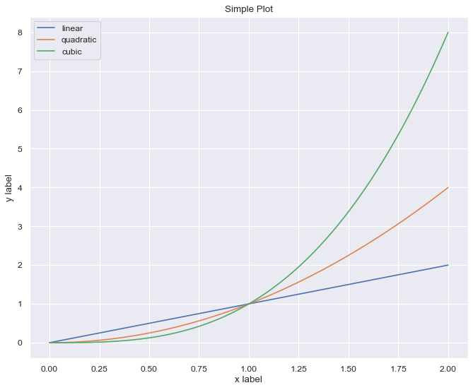
For every single ‘Figure’, always label each axis. use title for axes. when there’s more than one data type to draw, use legend.
Matplotlib Object-Oriented
First, make we should make a Figure. then we add axes to it.
x = np.linspace(0, 2, 100)

fig = plt.figure(figsize=(10, 8))
fig.suptitle('A figure with subplots', fontsize=16)

ax_1 = fig.add_axes([0, 0, 1, 0.4])
ax_2 = fig.add_axes([0, 0.5, 0.4, 0.4])
ax_3 = fig.add_axes([0.5, 0.5, 0.5, 0.4])

ax_1.plot(x, x, label='linear')
ax_2.plot(x, x**2, label='quadratic')
ax_3.plot(x, x**3, label='cubic')

ax_1.set_xlabel('x')
ax_2.set_ylabel('y')
ax_3.set_title('Comparison')

ax_2.legend(loc='best')
<matplotlib.legend.Legend at 0x7f75bd73d3a0>
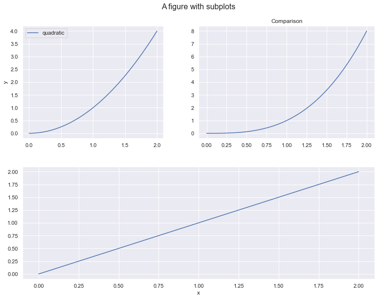
Also, we can draw a plot within another plot.
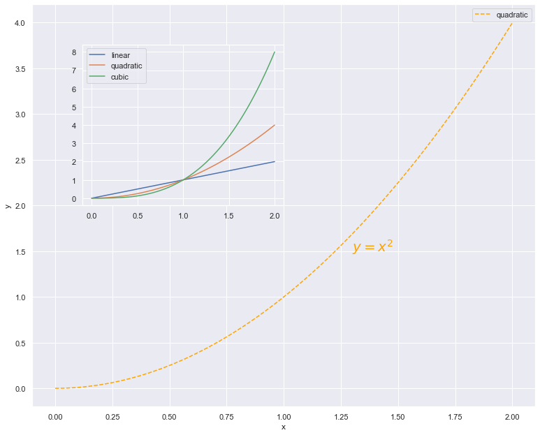
x = np.linspace(0, 2, 100)

fig = plt.figure(figsize=(10, 8))

ax_1 = fig.add_axes([0, 0, 1, 1])
ax_2 = fig.add_axes([0.1, 0.5, 0.4, 0.4])

ax_1.plot(x, x**2, label='quadratic', color='orange', linestyle='dashed')
ax_1.text(1.3, 1.5, r"$y=x^2$", fontsize=20, color="orange")
ax_1.grid(True)

ax_2.plot(x, x, label='linear')
ax_2.plot(x, x**2, label='quadratic')
ax_2.plot(x, x**3, label='cubic')

ax_1.set_xlabel('x')
ax_1.set_ylabel('y')

ax_1.legend(loc='best')
ax_2.legend(loc='best')
<matplotlib.legend.Legend at 0x7f75bd60dc40>
For separate axes, we can easily use subplots().
fig, axes = plt.subplots(nrows=1,ncols=3, figsize=(10,8))

for i in range(3):
    axes[i].plot(x, x**(i+1))
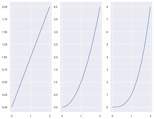
It’s clear that the above figure is not intuitive. axes all sit side by side with a different scale on the y-axis. and there’s no point in that figure besides didactic reason.
Bad Visualisation
1. inconsistent scale
x_1 = np.linspace(0, 1, 80, endpoint=False)
x_2 = np.linspace(1, 2, 20)
x = np.concatenate((x_1, x_2))
plt.figure(figsize=(10, 8), dpi=80)
plt.plot(x, label='linear')
plt.plot(x**2, label='quadratic')
plt.plot(x**3, label='cubic')
plt.xlabel('x label')
plt.xticks([0, 20, 40, 60, 80, 90, 100], [0, 0.25, 0.5, 0.75, 1, 1.5, 2])
plt.ylabel('y label')
plt.title("Simple Plot")
plt.grid(True)
plt.legend()
<matplotlib.legend.Legend at 0x7f75bd3b3be0>
This is broken. in this plot the range from 1 to 2 on the x-axis is denser than the same range from 0 to 1. this easily leads you to misinterpretation.
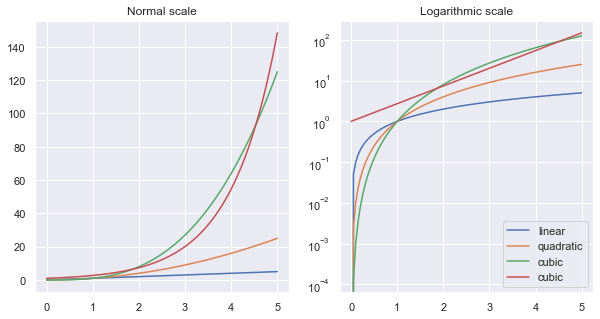
Don’t get it wrong, it is advised to use other scales rather than linear space when it’s beneficial. just be consistent and declare that the plot isn’t drawn on linear space.
x = np.linspace(0, 5, 100)
fig, axes = plt.subplots(1, 2, figsize=(10,5))

axes[0].plot(x, x, label='linear')
axes[0].plot(x, x**2, label='quadratic')
axes[0].plot(x, x**3, label='cubic')
axes[0].plot(x, np.exp(x), label='cubic')
axes[0].set_title("Normal scale")
axes[0].grid(True)

axes[1].plot(x, x, label='linear')
axes[1].plot(x, x**2, label='quadratic')
axes[1].plot(x, x**3, label='cubic')
axes[1].plot(x, np.exp(x), label='cubic')
axes[1].set_yscale("log")
axes[1].set_title("Logarithmic scale")
axes[1].grid(True)

axes[1].legend(loc='best')
<matplotlib.legend.Legend at 0x7f75bd2f1f10>
2. Wrong type of chart
- is data quantitative or qualitative?
- is quantitative continuous or discrete?
flights = sns.load_dataset("flights")
flights_1957 = flights[flights.year == 1957]
flights_1957.head(12)
| year | month | passengers | |
|---|---|---|---|
| 96 | 1957 | Jan | 315 |
| 97 | 1957 | Feb | 301 |
| 98 | 1957 | Mar | 356 |
| 99 | 1957 | Apr | 348 |
| 100 | 1957 | May | 355 |
| 101 | 1957 | Jun | 422 |
| 102 | 1957 | Jul | 465 |
| 103 | 1957 | Aug | 467 |
| 104 | 1957 | Sep | 404 |
| 105 | 1957 | Oct | 347 |
| 106 | 1957 | Nov | 305 |
| 107 | 1957 | Dec | 336 |
fig, axe = plt.subplots(1, figsize=(10,5))
axe.scatter(list(flights_1957.month), list(flights_1957.passengers), color='orange')
axe.plot(list(flights_1957.month), list(flights_1957.passengers), linestyle='dashed')
[<matplotlib.lines.Line2D at 0x7f75bd605130>]
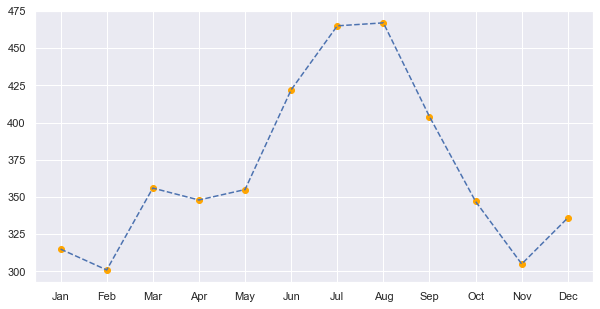
Data is not continuous. so we’re not allowed to draw a line between two consecutive months.
3. Too many variables
diamonds = sns.load_dataset("diamonds")
fig = plt.figure(figsize=(10,8))
ax = diamonds.color.value_counts().plot(kind='pie')
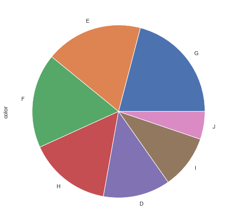
Too many variables, especially in the pie chart make it useless. use other categories or bar charts.
4. readability
Seaborn and Which Type for What Reason?
- Trends:
- Line charts:
seaborn.lineplot
- Line charts:
- Relationship:
- Bar charts:
seaborn.barplot - Heatmaps:
seaborn.heatmap - Scatter plots:
seaborn.scatterplotandseaborn.swarmplot - regression line:
seaborn.regplotand seaborn.lmplot
- Bar charts:
- Distribution
- Histograms: seaborn.displot and
seaborn.histplot - KDE plots:
seaborn.kdeplotandseaborn.jointplot
- Histograms: seaborn.displot and
tips = sns.load_dataset('tips')
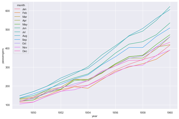
Trends
sns.lineplot(data=flights, x="year", y="passengers", hue="month")
<AxesSubplot:xlabel='year', ylabel='passengers'>
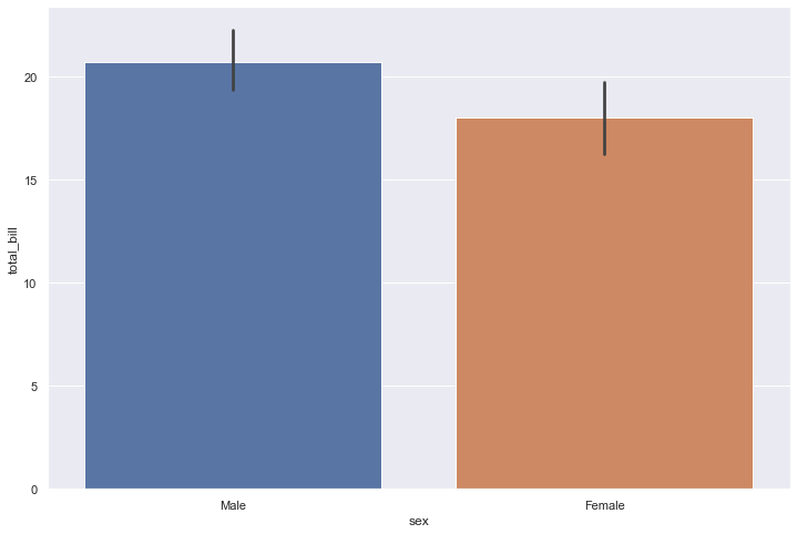
Relationship
sns.barplot(x='sex', y='total_bill', data=tips)
<AxesSubplot:xlabel='sex', ylabel='total_bill'>
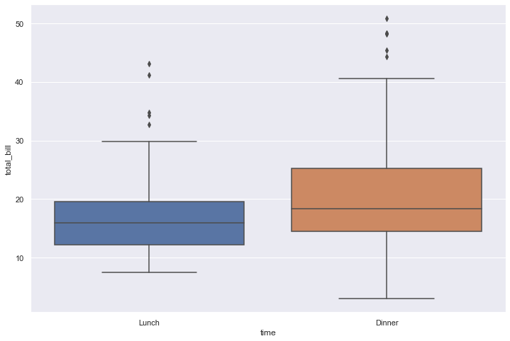
sns.boxplot(x='time', y='total_bill', data=tips)
<AxesSubplot:xlabel='time', ylabel='total_bill'>
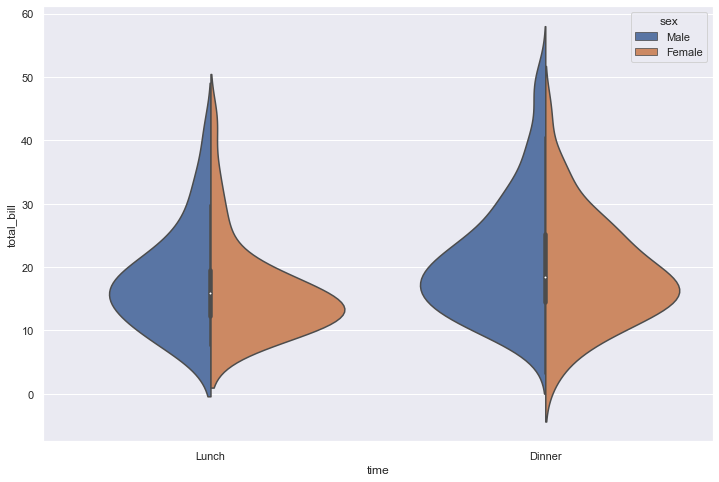
sns.violinplot(x='time', y='total_bill', data=tips, hue='sex', split=True)
<AxesSubplot:xlabel='time', ylabel='total_bill'>
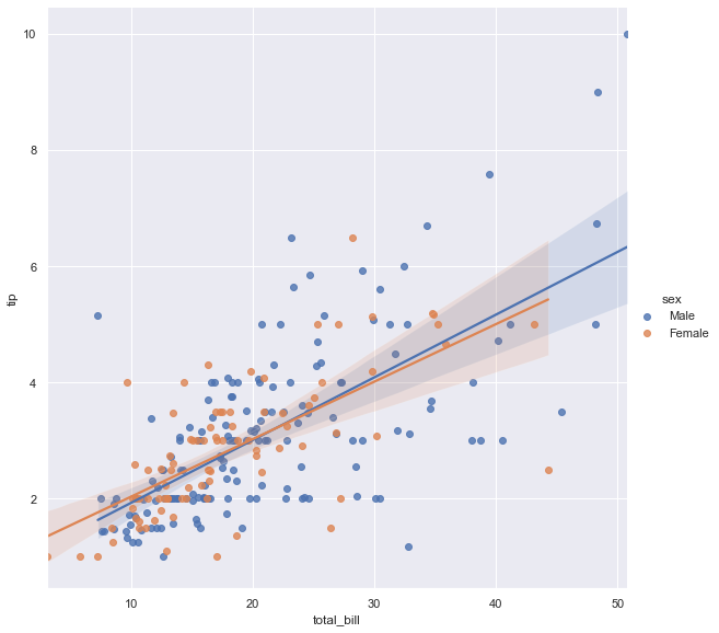
sns.lmplot(x='total_bill', y='tip', data=tips, hue='sex', height=8, aspect=1)
<seaborn.axisgrid.FacetGrid at 0x7f75b970b970>
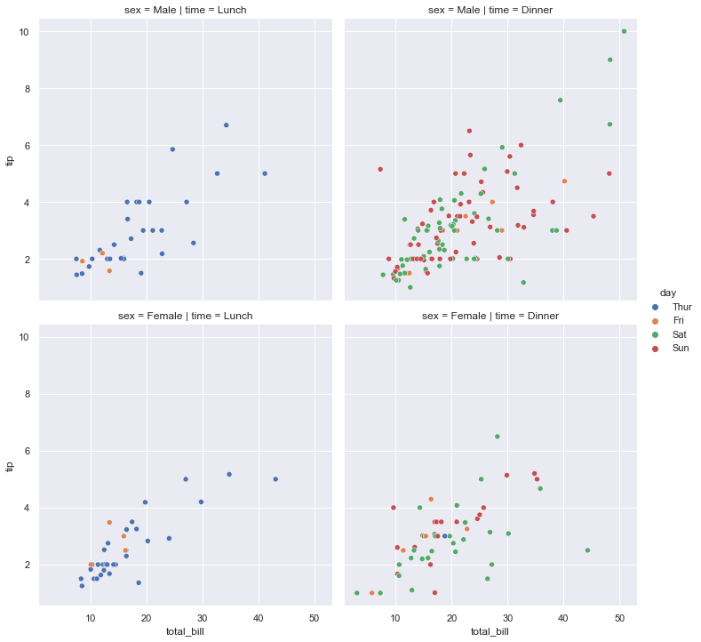
sns.relplot(data=tips, x="total_bill", y="tip", hue="day", col="time", row="sex")
<seaborn.axisgrid.FacetGrid at 0x7f75b97121f0>
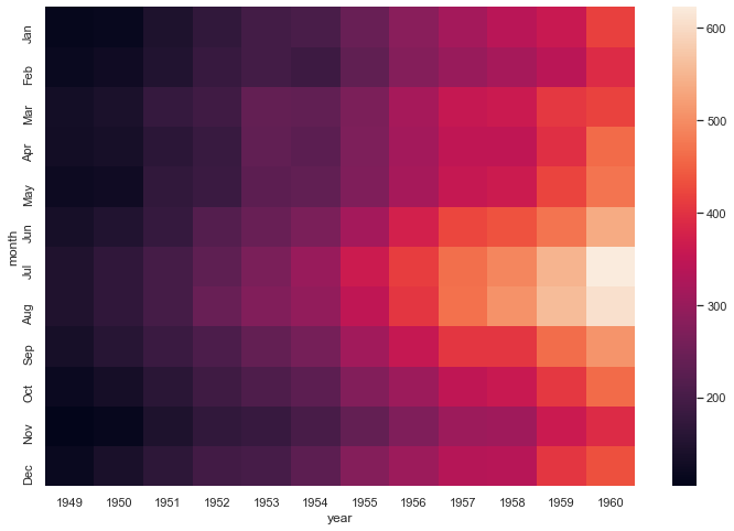
flights = sns.load_dataset('flights')
flights_pv = flights.pivot_table(index='month', columns='year', values='passengers')
sns.heatmap(flights_pv)
<AxesSubplot:xlabel='year', ylabel='month'>
Distributions
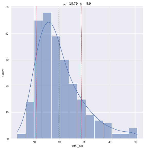
tips = sns.load_dataset('tips')
tips_mean = tips.total_bill.mean()
tips_sd = tips.total_bill.std()

ax = sns.displot(data=tips, x="total_bill", kde=True, height=8)

plt.axvline(x=tips_mean, color='black', linestyle='dashed')

plt.axvline(x=tips_mean + tips_sd, color='red', linestyle='dotted')
plt.axvline(x=tips_mean - tips_sd, color='red', linestyle='dotted')

plt.title('$\mu = {}$ | $\sigma = {}$'.format(round(tips_mean, 2), round(tips_sd, 2)))
Text(0.5, 1.0, '$\\mu = 19.79$ | $\\sigma = 8.9$')
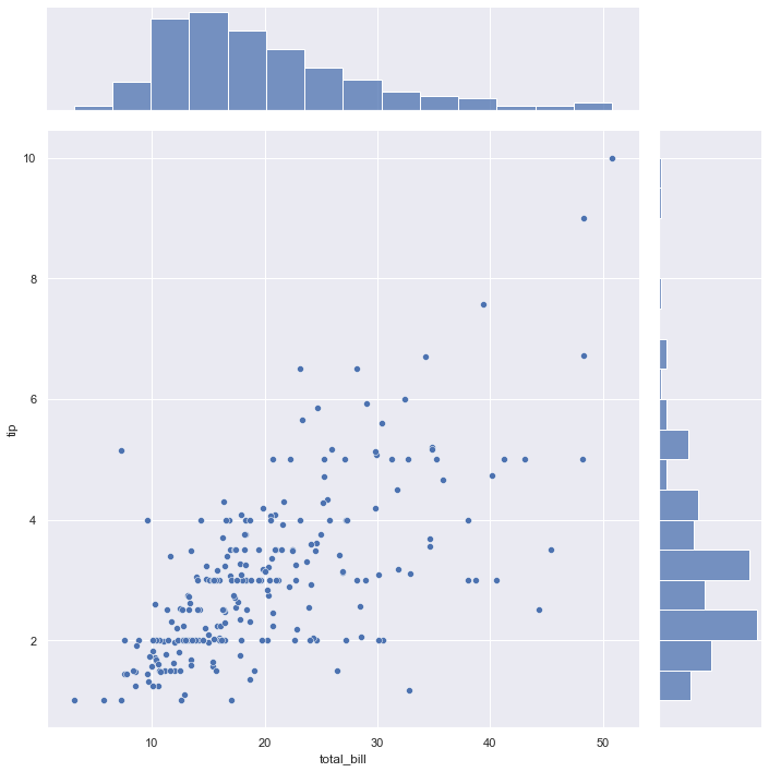
sns.jointplot(x=tips['total_bill'], y=tips['tip'], height=10)
<seaborn.axisgrid.JointGrid at 0x7f75b93f5ca0>
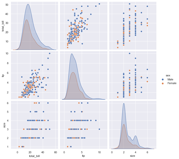
sns.pairplot(tips, hue='sex', height=3)
<seaborn.axisgrid.PairGrid at 0x7f75b9415b50>
Further readings
The first two are strongly recommended, trust me you won’t regret it! :)
- Python Graph Gallery, A general guide for visualizing every type of data in python
- Data-to-Viz
- Fundamentals of Data Visualization by Claus O. Wilke
- Storytelling with Data by Cole Nussbaumer Knaflic
- Matplotlib Cheatsheets